Marcin Zaremski
A5 Quick Landing Page Hacks to Boost Your SaaS Conversion Rates
Paying attention to every landing page we can spot some nice hacks we can take advantage of.
While doing some SaaS landing page roasts on x.com, I saw a few patterns where founders can improve their landing page conversions immediately.
1. Grab user’s attention with just their location
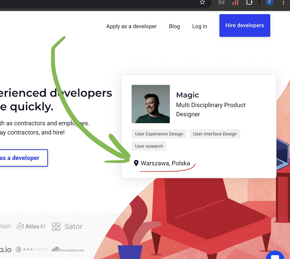
The simplest and quickest conversion hack is to simply add localisation of the user. It grabs attention tremendously and is super easy to implement. The hack can be implemented right away unlike the next tip.

2. Show testimonials based on the user’s location
If you have enough testimonials, you can match their origin with the location of the user.
I found it recently on moonlightwork.com landing page. I was indeed surprised by it.
Even If I was not interested in the product when I entered the website, I started to pay attention to what it exactly was. So it is the best example that it works.
The next step of personalised testimonials
The next step would be to personalize the testimonial. When the potential client is a CTO and opens the landing page. They would be more convinced if the testimonial was from another CTO. But it’s indeed more difficult to implement than just base targeting testimonials on the location.
Although one of the ways to implement this, is to prepare a parameter in the URL (eg. ?testimonials=cto) and make sure, the link is distributed in offers/ads/articles targeted to CTOs.
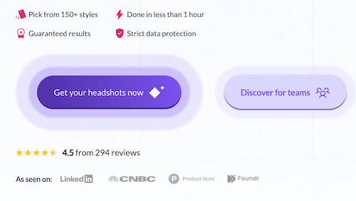
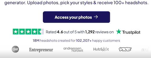
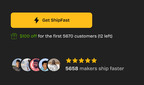
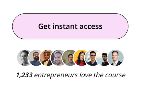
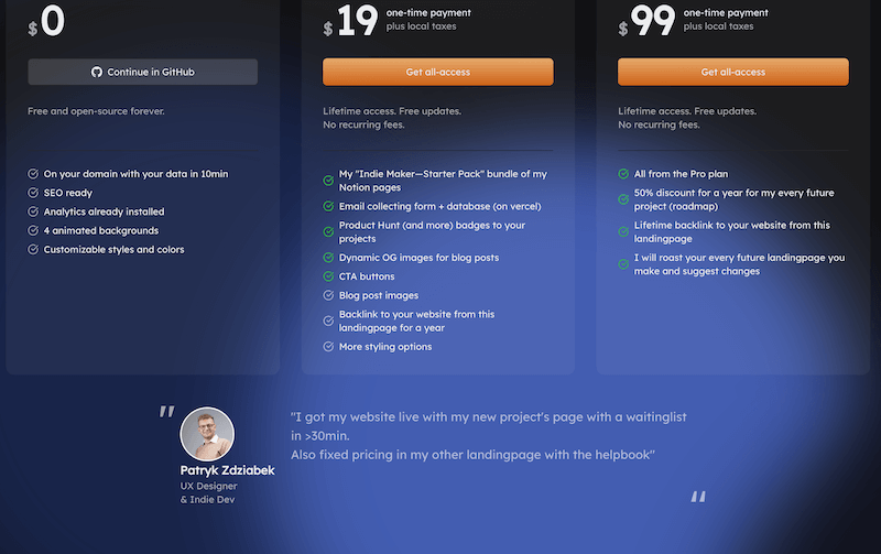
3. Put social proof closer to CTA (and in pricing section) (up to +68%)
Even the best landing page can improve conversion by reminding the user that it's worth clicking the CTA button. Quoting:
“Including social proof under its landing page CTA helped Augmentive increase its conversion rate by 68%.” (Source: HubSpot, source at the very bottom)
You don't need to redesign anything thanks to the simplicity of this. It is so simple and effective. It was a no-brainer for me to implement.
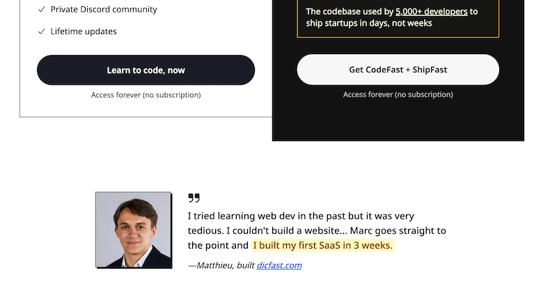
Take a look at the examples below:
Social proof close to CTA examples
Close to pricing testimonial
4. Add CTA on the bottom (up to +304%)
In cases of long landing pages, scrolling back to the very beginning to click CTA can drop out some clients.
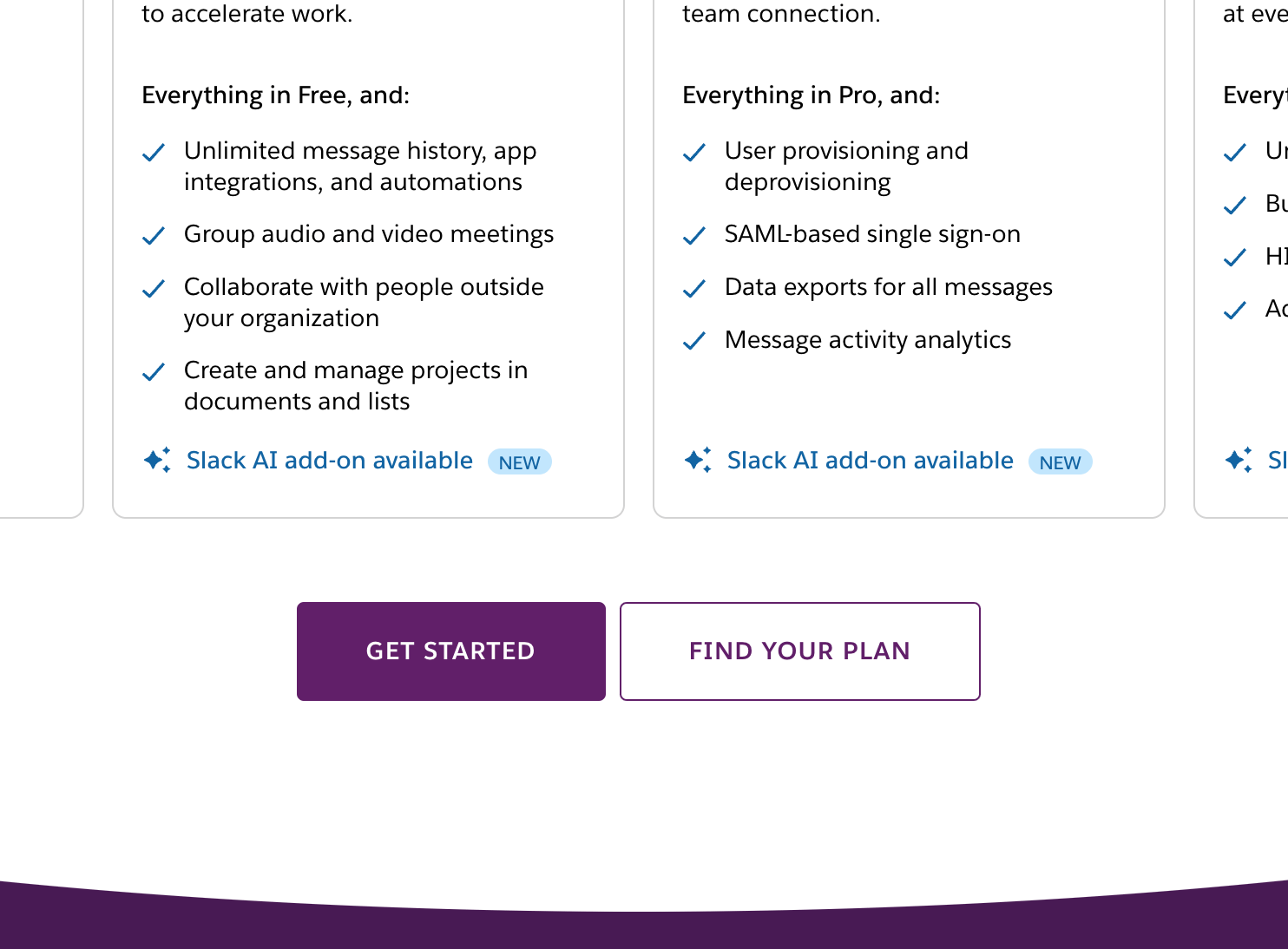
But what is more shocking, in one example putting CTA at the very bottom, increased the conversion by 304% which is crazy. (Source: HubSpot, source at the very bottom)
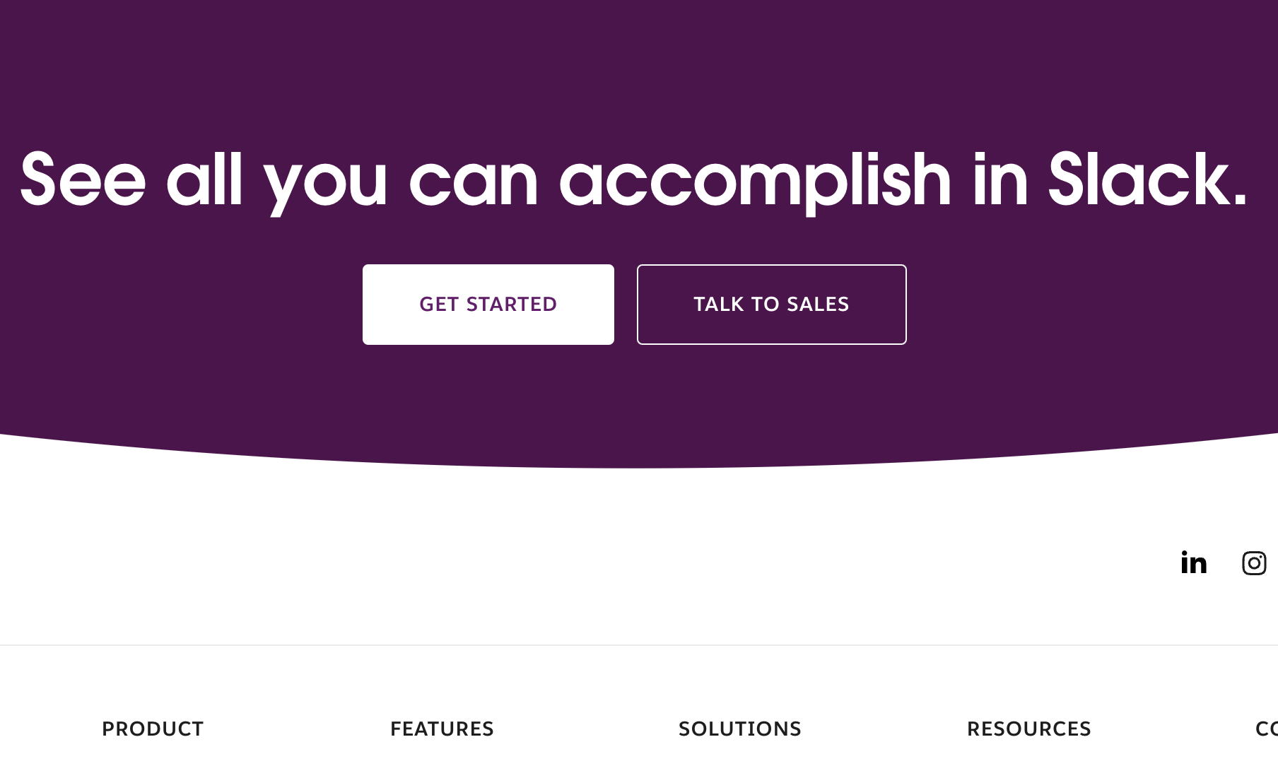
Other examples are CodeFast of Marc Lou and Slack. They both have CTA at the very bottom, but what is even more interesting, Slack have multiple primary CTA on the landing page.
- In the NavBar
- In the hero section
- Half the page on the pricing section
- At the very bottom
Source: slack.com, codefa.st

5. Value Proposition
Didn’t want to include at first, but it’s a common copywriting trick, but I see it’s often forgotten. No matter if you are a newbie, or in the business.
The tip is to make an outcome-oriented, specific Value Proposition in the headline. User after 1s needs to know what they get using the service.
Riverside
In the case of podcast optimisation platform:
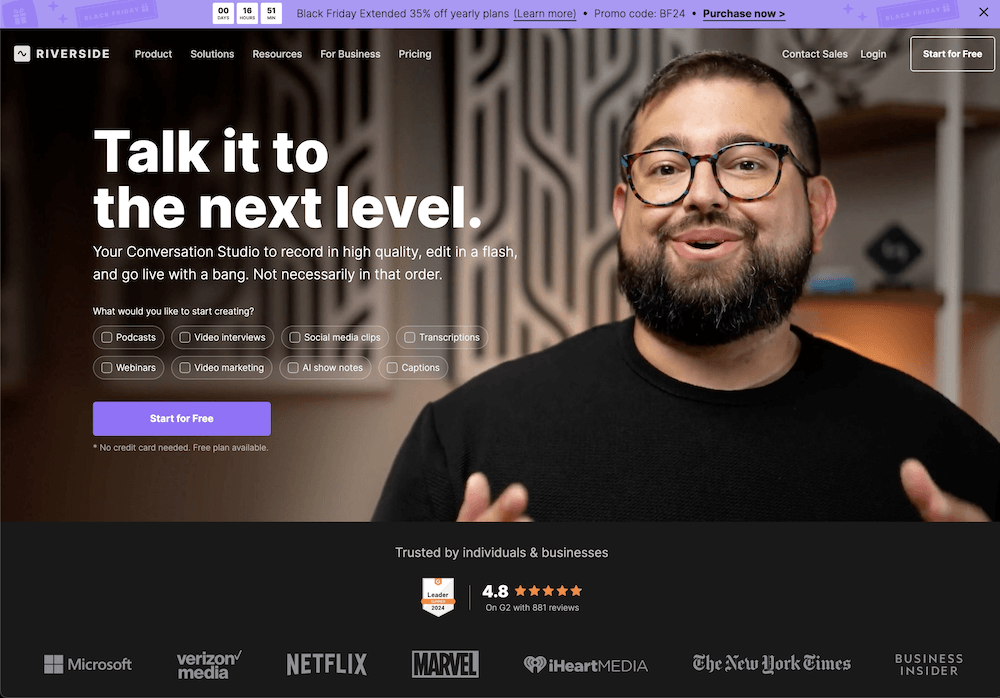
❌ Bad: Talk it to the next level.
- It is a cool slogan but tells nothing at first second.
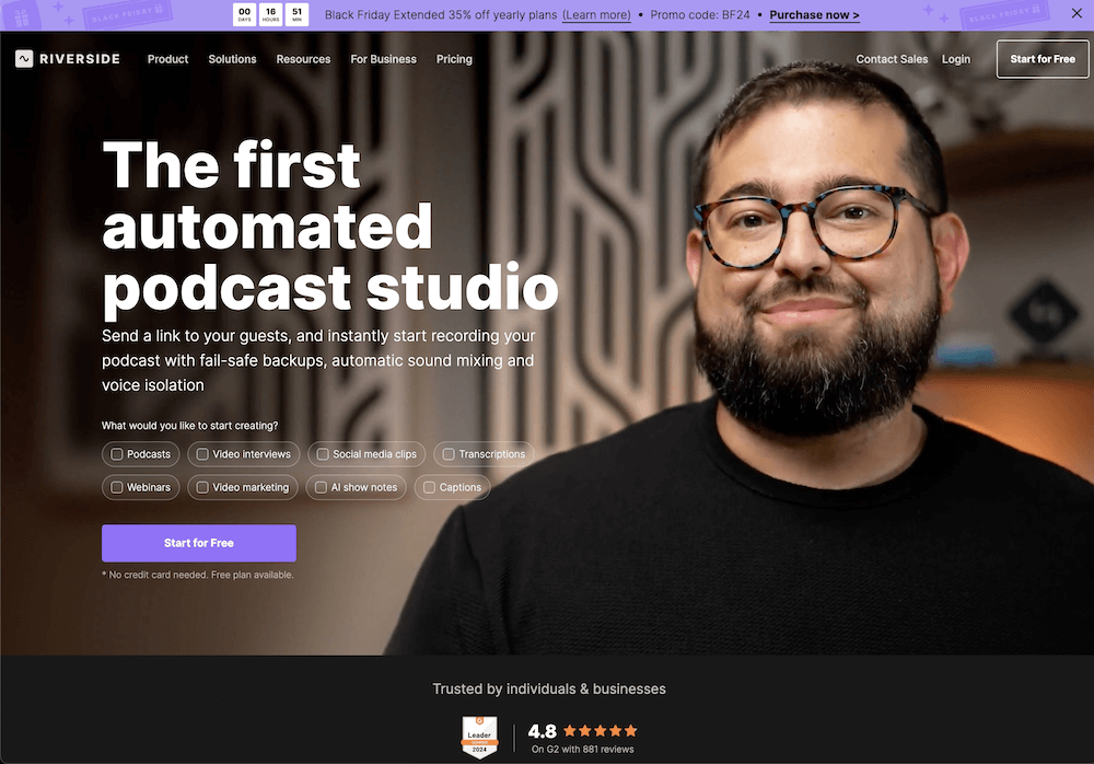
⚪️ Better: The first automated podcast studio
- At least we know what the prod is.
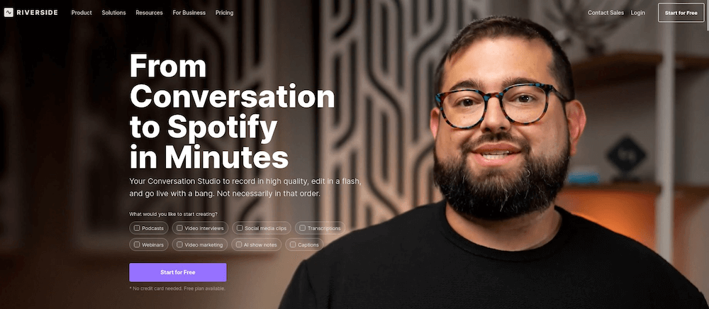
✅ Great: From Conversation to Spotify in Minutes
- It is outcome-oriented AND specific (in Minutes). The client knows what they get with this platform in 1s.
Eleven Labs
✅ Create the most realistic speech with our AI audio platform
- Very Good, I know what I get. It’s literally what they do.
Cursor vs Windsurf IDE vs VSC
Cursor: ❌ The AI Code Editor
- It’s not outcome-oriented. I can’t see what I get because of the AI Code Editor although I use it on a daily basis.
Windsurf: ⚪️ Built to keep you in flow state
- Kind of outcome-oriented - the flow state. But in my opinion, the flow state is not the final outcome of why we write code.
VSC: ✅ Code faster with AI
- We know what it does, and what it gives. It is simple, but IMO it's better than previous one.
Mine: ✅ Code faster with AI in chunks, not in lines.
- I must admit, it was not easy. It is still not specific enough. But at least we know what to expect and it’s literally what I see first when I think about VSC and Cursor/Windsurf. (Maybe would be good to gather some review of how much faster we code and based on this prepare VP?)
PerSite Boilerplate
Let's also take my product as an example: mzaremski.com/persite
❌ Your Personal Website Boilerplate
❌ Create your blog+website with PerSite Boilerplate
✅ Your SEO ready personal website + blog in 10min
The last one is outcome-oriented and specific. You know what you get, very fast.
Read more
- There is a source: blog.hubspot.com/marketing/personalized-calls-to-action-convert-better-data
- You are also welcome on my x.com where I share more landing page hacks & more.